Components / Lists and data
u:tree
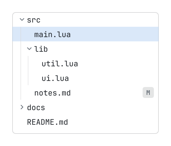
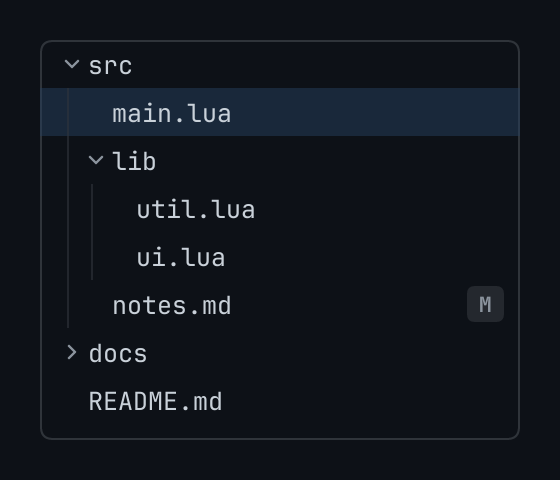
A tree of what has children: roots are the keys of its top level, children the keys under one, item what to show of it: { title, icon, tone, badge, hint }.
The code
local files = {
	src = { "src/main.lua", "src/lib", "src/notes.md" },
	["src/lib"] = { "src/lib/util.lua", "src/lib/ui.lua" },
	docs = { "docs/guide.md" },
}
local state = { expanded = { src = true, ["src/lib"] = true }, cursor = "src/main.lua" }

return pencere.div():h(200):border(1, "border"):rounded(6):clip():child(
	u:tree("files", {
		roots = { "src", "docs", "README.md" },
		children = function(key) return files[key] end,
		item = function(key)
			return { title = string.match(key, "[^/]+$"), badge = key == "src/notes.md" and "M" or nil }
		end,
		state = state,
	}))
What it does
A tree of what has children (files, symbols, a schema): roots are the keys of its top level, children(key) the keys under one (nil for what has none; an empty list for a node whose children the page has not read yet, which it reads when it hears expand), item(key) what to show of it: { title, icon, tone, badge, hint }. state is { expanded, cursor }: a set of the keys open and the key chosen, the page's, so that what is open outlives the tree being drawn. A long tree is built as it is scrolled, as a list is.
The pointer chooses a row (select), opens a folder with a press on it or on its arrow (expand { key, open }), and opens what has no children with a second press (open { key, how }); the right button asks for a menu (context { key, at }). With the keyboard (key_map maps others, as a list's): the arrow keys, home, end and page up and down move, right opens a folder and goes into it, left closes it and goes out of it, enter opens a file or toggles a folder. guides (the default) draws a line down each level of depth.
Its icon
An icon that a component or one of its items takes is an element the page made, a path of the page's own bundle ("icons/save.svg": an SVG or a PNG, tinted in the colour the component draws it in), or the name of one of the library's glyphs: check, chevron_down, chevron_left, chevron_right, chevron_up, close, dash, dot, info, plus, warning.