Components / Fields and choices
u:input
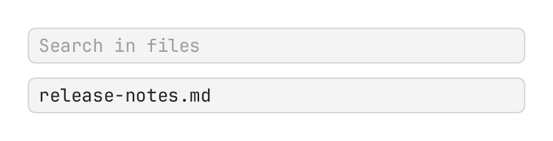
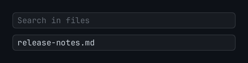
A field of text, the host's own in a box of the theme.
The code
local query = { value = "" }
local name = { value = "release-notes.md" }

return pencere.div():gap(10)
	:child(u:input("query", { state = query, hint = "Search in files", label = "Search in files" }))
	:child(u:input("name", { state = name, label = "File name" }))
What it does
A field of text, the host's own (it is edited as the system's fields are) in a box of the theme. state.value is what it holds: the page keeps the table and the field is made to hold what it says whenever it says another thing (u:field_text); what the person types is put in it. label says what it is to a screen reader (it is needed), hint what the field says while it is empty, kind is "line" (the default), "secret" or "lines", tone ("bad" …) colours its edge, lead and trail are elements before and after the text (an icon, the options of a search). With select, what is put in the field is selected in it, as a palette opened again has its query. escape makes escape in it an action of its own ({ kind = "escape" }), where it would close the layer it is in. The field's own name is u:name(id, "field"); u:focus(id) puts the keyboard in it.