Components / Fields and choices
u:segments
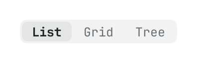
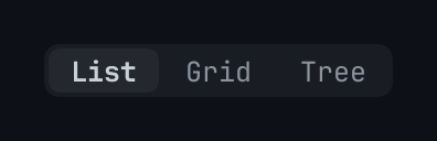
A few words side by side, one of them chosen: { kind = "select", key } by the pointer, or by the arrow keys, home and end while the chosen one has the keyboard.
The code
return u:segments("view", { value = "list", items = {
	{ key = "list", title = "List" },
	{ key = "grid", title = "Grid" },
	{ key = "tree", title = "Tree" },
} })
What it does
A few words side by side, one of them chosen (value, a key of items): { kind = "select", key } by the pointer, or by the arrow keys, home and end while the chosen one has the keyboard (only the chosen one is in the order of the tab key, as a group of radio buttons is). A screen reader hears radio buttons.
Its icon
An icon that a component or one of its items takes is an element the page made, a path of the page's own bundle ("icons/save.svg": an SVG or a PNG, tinted in the colour the component draws it in), or the name of one of the library's glyphs: check, chevron_down, chevron_left, chevron_right, chevron_up, close, dash, dot, info, plus, warning.