Components
The components of a page (local ui = require("@pencere/ui")), written on the page API alone: a component is a method of a context that the page makes once (local u = ui.new()) and calls in render with a name and its props, and what the person does with it comes back from handle as actions.
Controls


A button: its words, an icon before them, a tone, the keys that do the same, the tip's words, a label for a screen reader where the words do not say it, and disabled.

A button that is an icon alone: its label says what it does, to a screen reader and in its tip.
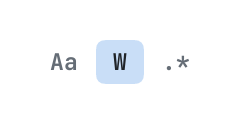
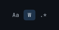
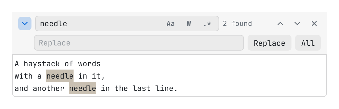
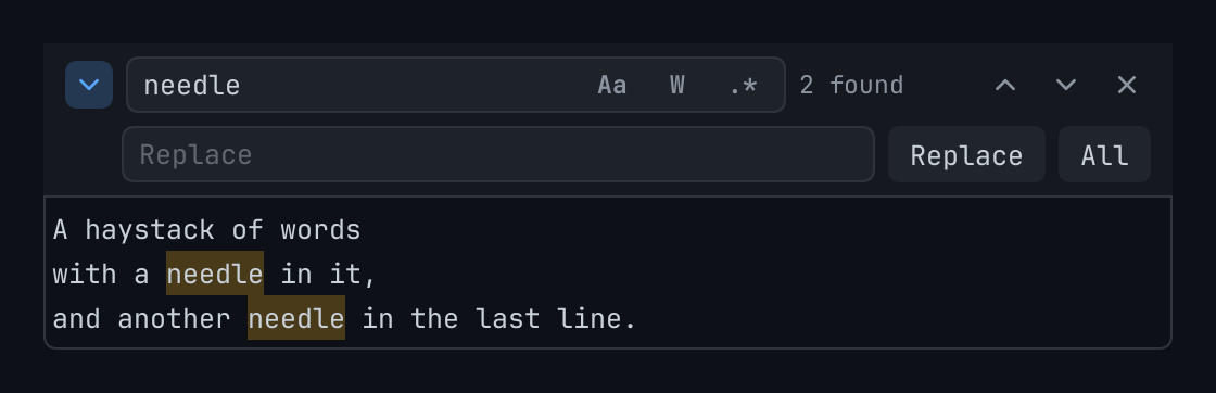
An option that is on or off, drawn as a small cap of words or an icon: the options of a search.


A badge: a count, a state in a word.
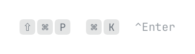
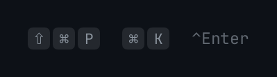
The keys of a shortcut as the platform writes them: a cap for each, or, with props.quiet, the label alone in quiet words.
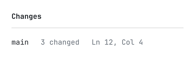
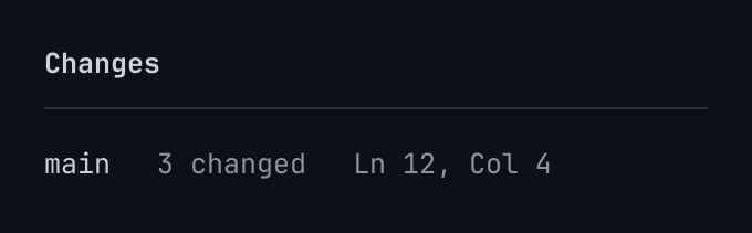
A rule: a line of the theme's line a point thick, across or down what it is in.


A strip that says something of what is below it, in a tone, with buttons that answer it: a file changed on disk, a draft to restore.
Fields and choices
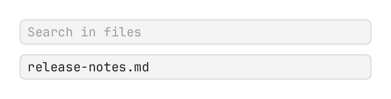
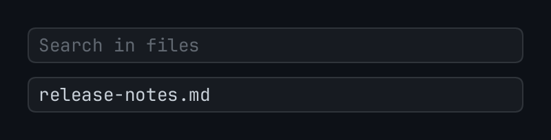
A field of text, the host's own in a box of the theme.
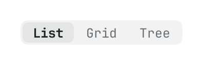
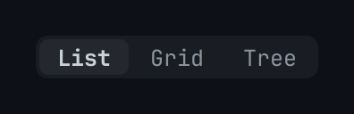
A few words side by side, one of them chosen: { kind = "select", key } by the pointer, or by the arrow keys, home and end while the chosen one has the keyboard.


Tabs in a strip that scrolls across: items are { key, title, hint, icon, dirty, closable, tone, tip }, active the key of the one in front.
Layers
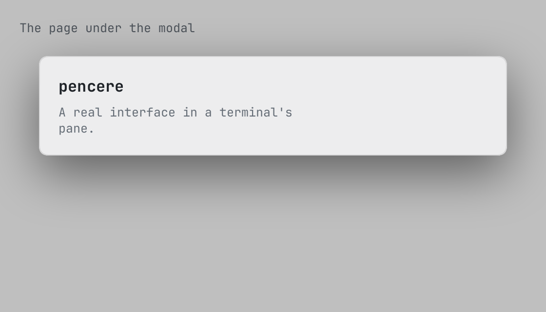
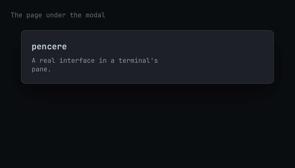
A modal: body in a card over a scrim.
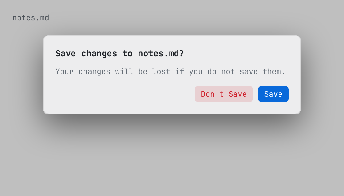
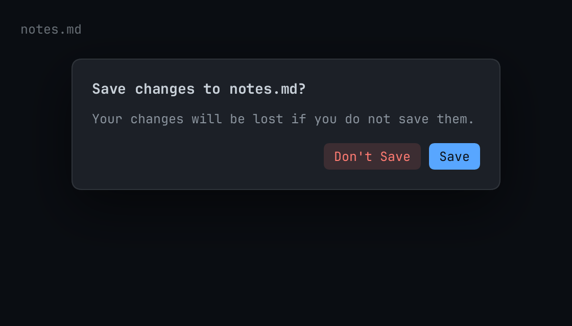
A question the page asks and the person answers: title, message, an input and actions.
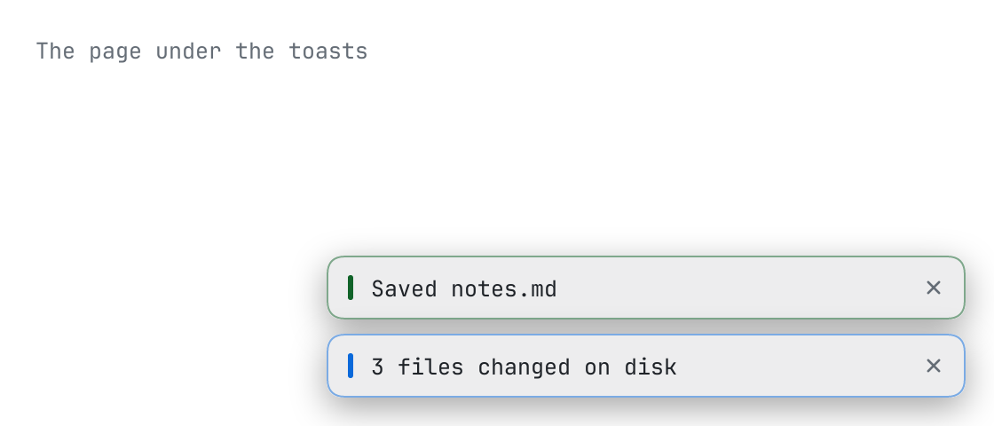
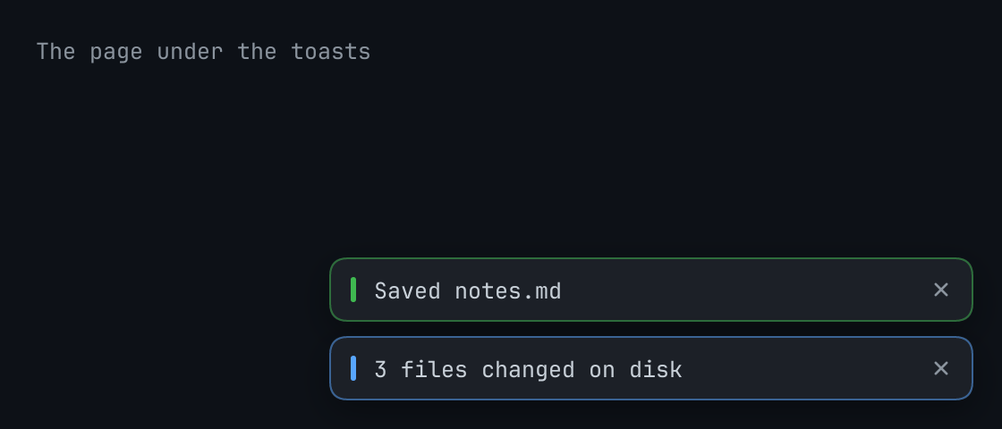
The toasts of the page, in a stack at the foot of the page's right edge, the newest below: items are { key, words, tone, at }.
The host's menu, at the element options.near, or at options.at where near is not laid out: the reply that asks for it, to be returned from handle, or nil where there is no place to open it at.
The reply that asks the host for the menu of the editor props.editor, to be returned from handle.
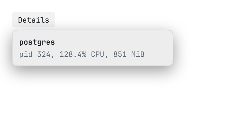
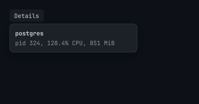
body in a card that stands beside an element, the caret of an editor or a range of its text, on side of it gap points away.
Lists and data
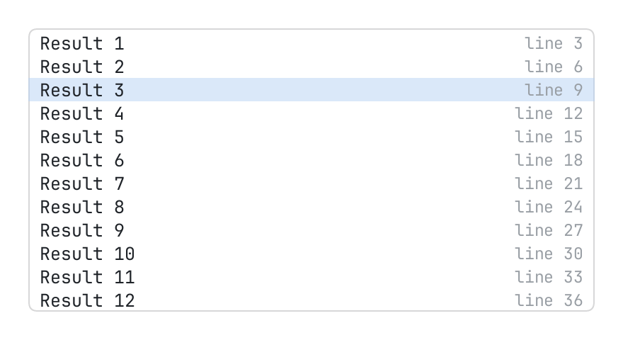
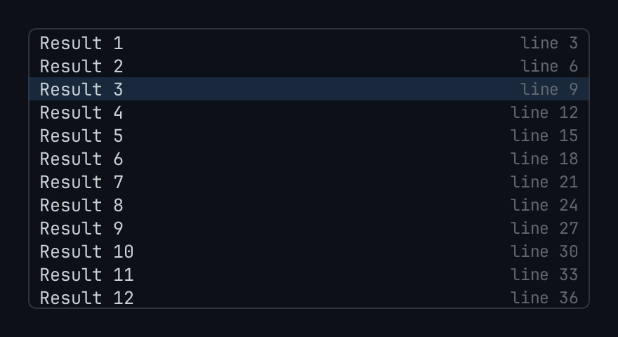
A long list of rows, built as the person scrolls.
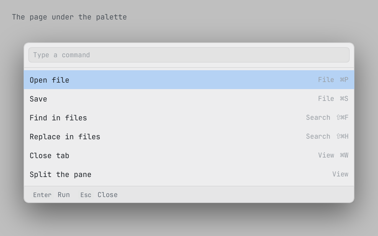
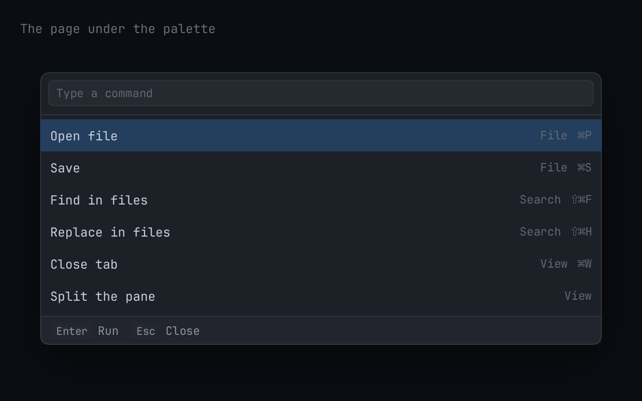
A palette: a field and under it the items that its query is in, the best first, the first one chosen.
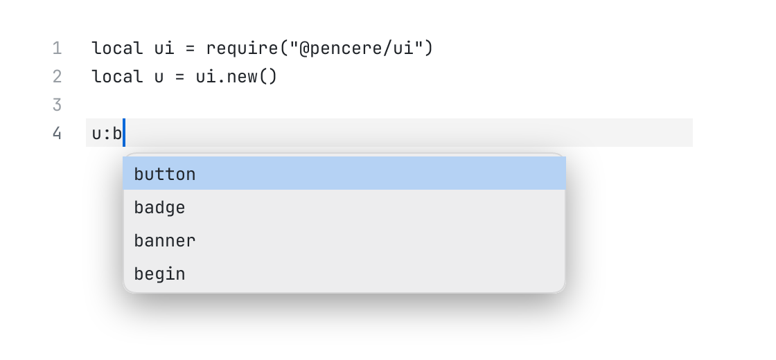
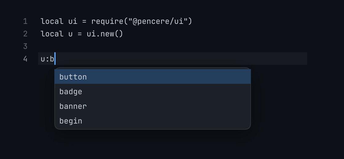
The completions of an editor: items in a card under the caret of the editor editor, drawn while the page gives items and stops when it gives none.
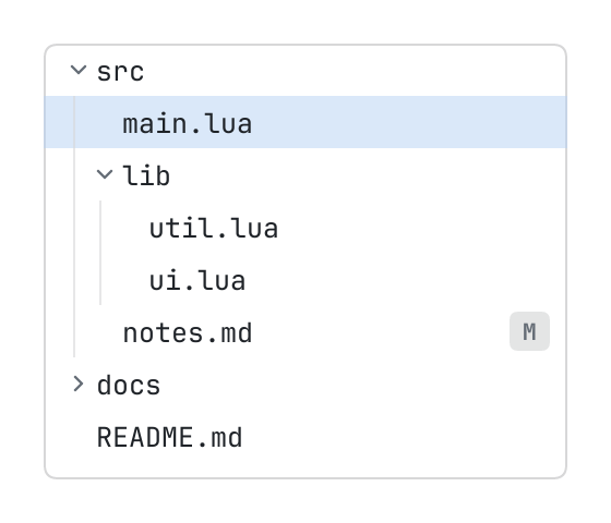
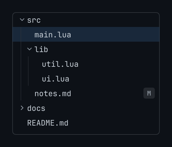
A tree of what has children: roots are the keys of its top level, children the keys under one, item what to show of it: { title, icon, tone, badge, hint }.
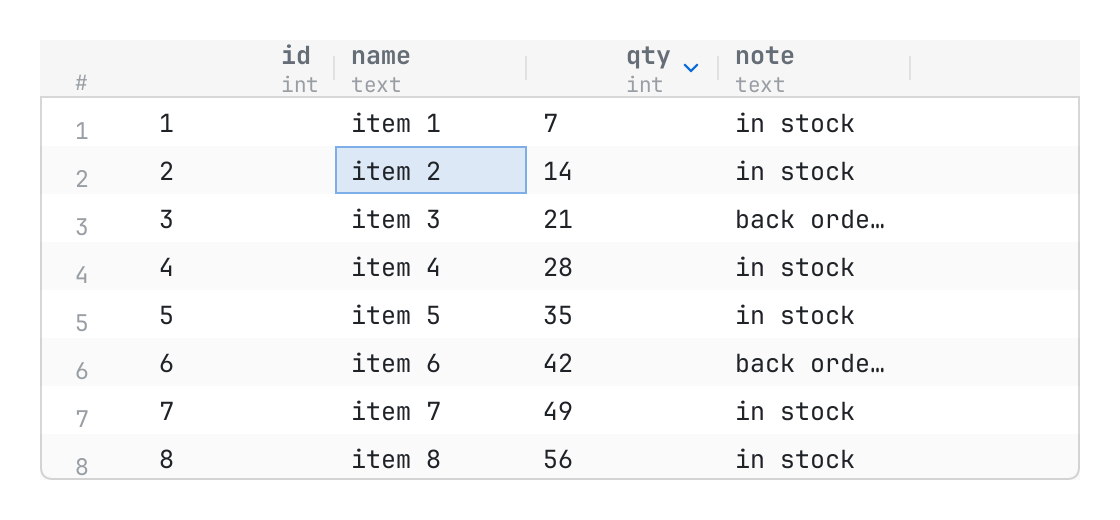
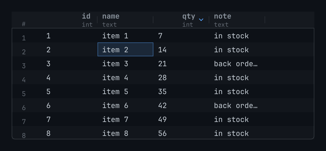
A grid of what a query or a table gives: columns are { key, title, type, align, width }, count how many rows there are, cell the value of one cell as words, an element, or nil where its row has not been read yet.
Layout
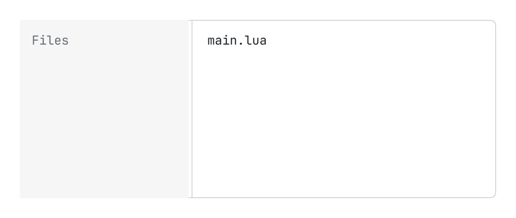
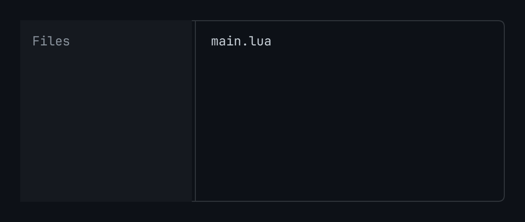
Two panes side by side and an edge between them that the person drags to size one: first and second are elements; side is the one that has the width, state.size points, between min and max.


A bar of what stands where: start, center and finish are lists of items { key, words, icon, tip, keys, priority, press, tone, width }.