Components / Controls
u:toggle
An option that is on or off, drawn as a small cap of words or an icon: the options of a search.
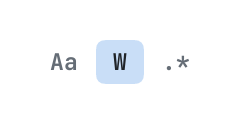
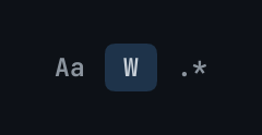
The code
return pencere.div():row():items_center():gap(4)
	:child(u:toggle("case", { on = false, glyph = "Aa", label = "Match case", keys = "alt+cmd+c" }))
	:child(u:toggle("word", { on = true, glyph = "W", label = "Whole word", keys = "alt+cmd+w" }))
	:child(u:toggle("regex", { on = false, glyph = ".*", label = "Regular expression", keys = "alt+cmd+r" }))
What it does
An option that is on or off, drawn as a small cap of words (glyph: "Aa", ".*") or an icon: the options of a search. label says what it is, to a screen reader and in its tip (with keys). Pressed, or enter or the space bar on it: { kind = "toggle", on = <what it is to become> }; the page keeps whether it is on and gives it back as on.
Its icon
An icon that a component or one of its items takes is an element the page made, a path of the page's own bundle ("icons/save.svg": an SVG or a PNG, tinted in the colour the component draws it in), or the name of one of the library's glyphs: check, chevron_down, chevron_left, chevron_right, chevron_up, close, dash, dot, info, plus, warning.